// DESIGN SOP · TECH FRONTIER
VISUAL
DESIGN
GUIDELINES
Handoff doc for designers producing carousels and thumbnails
Read this before producing anything. Both pieces — carousels and thumbnails — share the same brand system and must feel like the same show.
Each episode produces two things this doc covers:
- Carousels 8 vertical cards (9:16) for X and Instagram. Each card carries one quote or lesson pulled from the episode transcript. Posted as a carousel thread.
- YouTube Thumbnail One 16:9 thumbnail per episode. Two faces (Jack + guest) and a hook line. Should read at small size, stop the scroll, and match every other episode's thumbnail layout.
Don't write the copy yourself. The starting point is always the episode transcript run through the Claude skill.
/podcast-social-copy → paste the full episode transcript
Carousel Quotes
Run the transcript through the /podcast-social-copy skill in the shared Claude project. It returns exactly 10 carousel lessons and 5 thumbnail hooks. Each lesson becomes the headline on one card.
- Must land without the surrounding sentence — readable alone on a card
- Short enough to read at mobile preview size — aim for under 12 words
Thumbnail Hook Line
Same source — the skill returns 5 candidate hook lines. Pick one. Three lines max, big text, one yellow-highlighted phrase.
Photos — Carousels
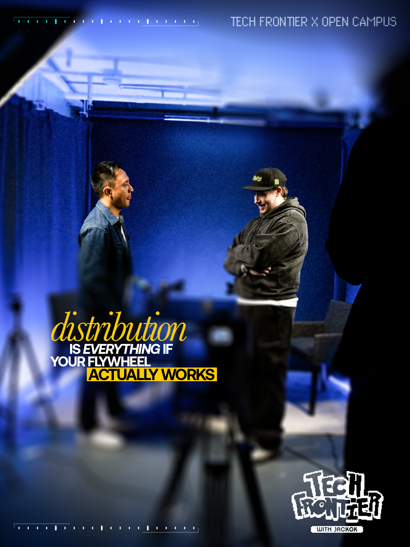
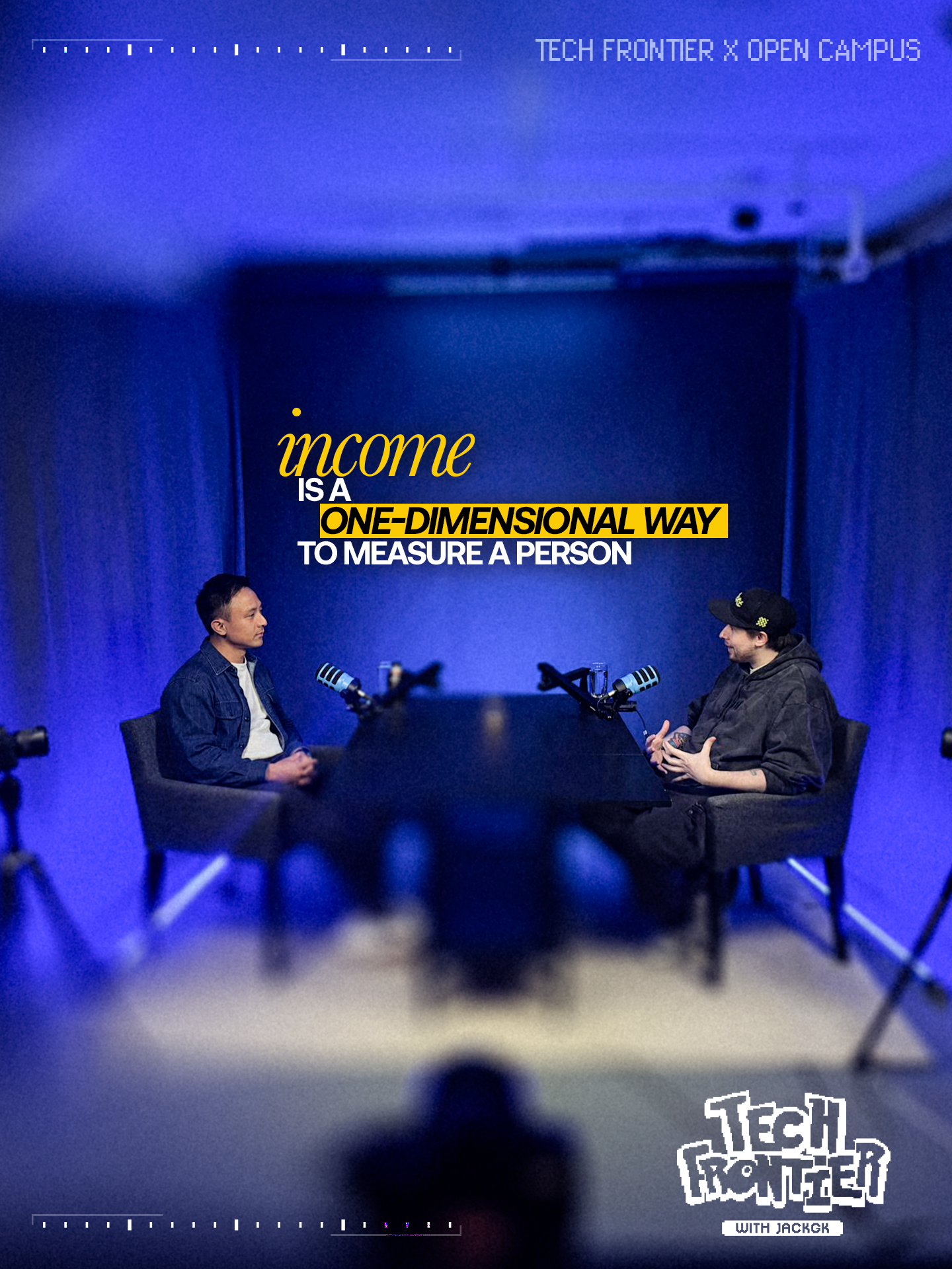
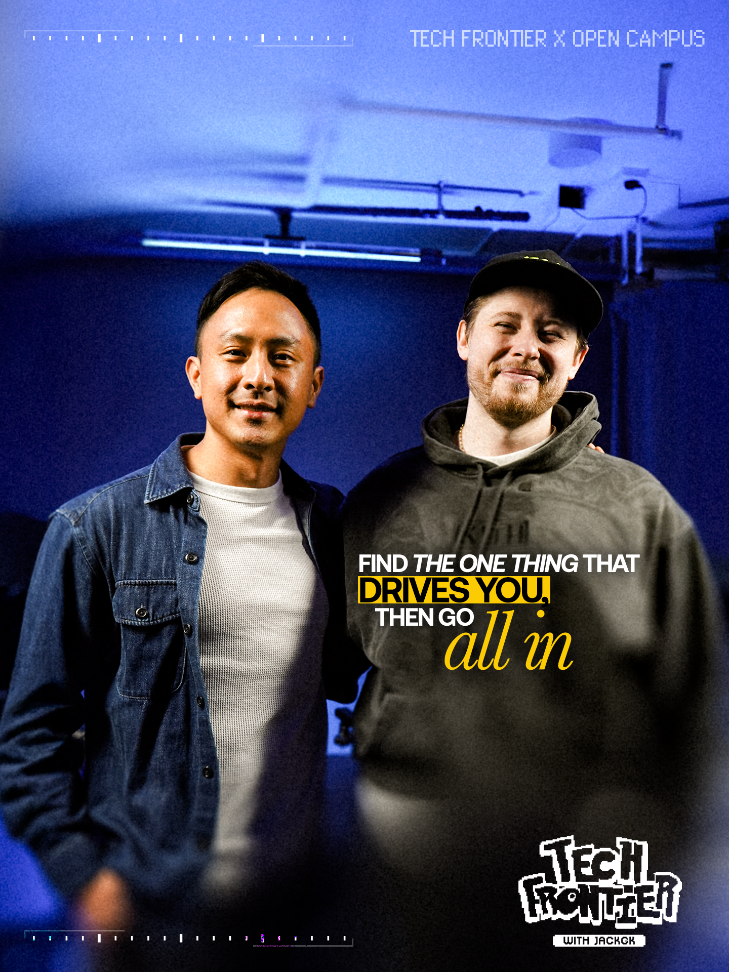
- BTS photos from KRP (preferred) Use these whenever they exist — they look the most cinematic and keep the carousel from looking repetitive. Source from the shoot folder for the episode.
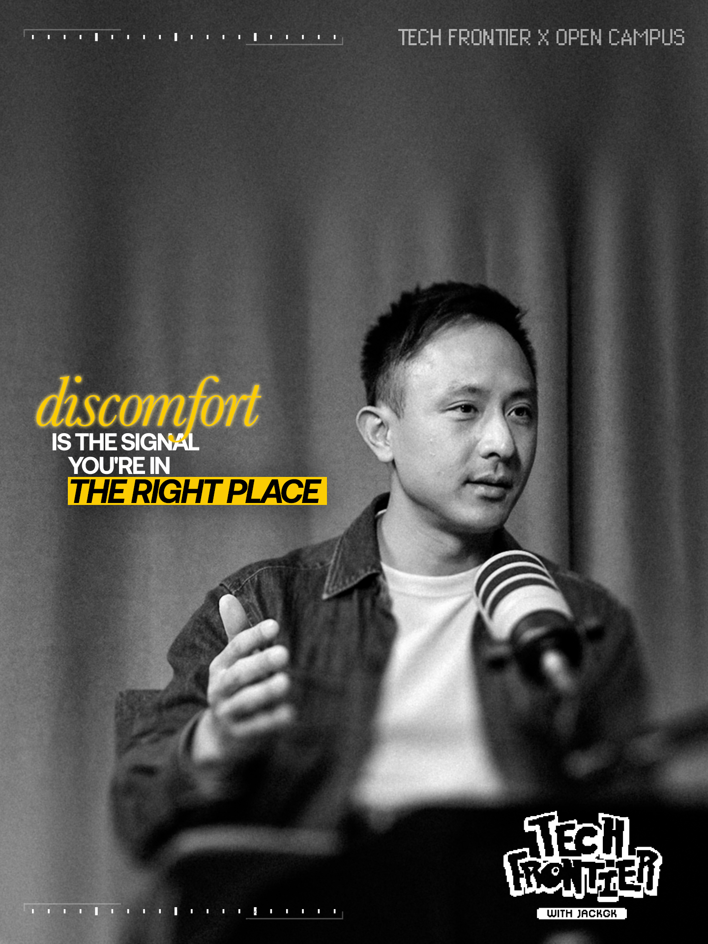
- Frame grabs from the podcast video (fallback) Use when BTS is missing or doesn't give enough varied angles. Requires generative-fill to extend the background to 9:16. Takes longer — avoid when possible.
Photos — Thumbnails
Thumbnails always use a frame grab or still from that specific episode — never a photo sourced elsewhere. The episode's actual background is kept and blurred behind the faces.
Open Campus — Full Set (C1–C8)
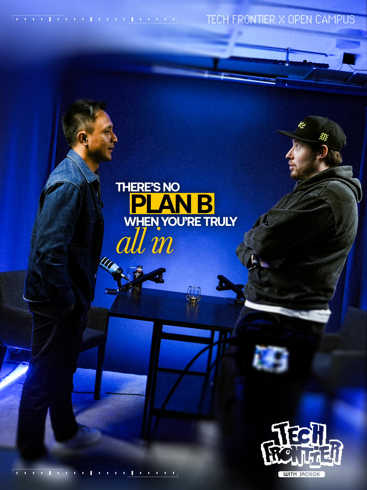
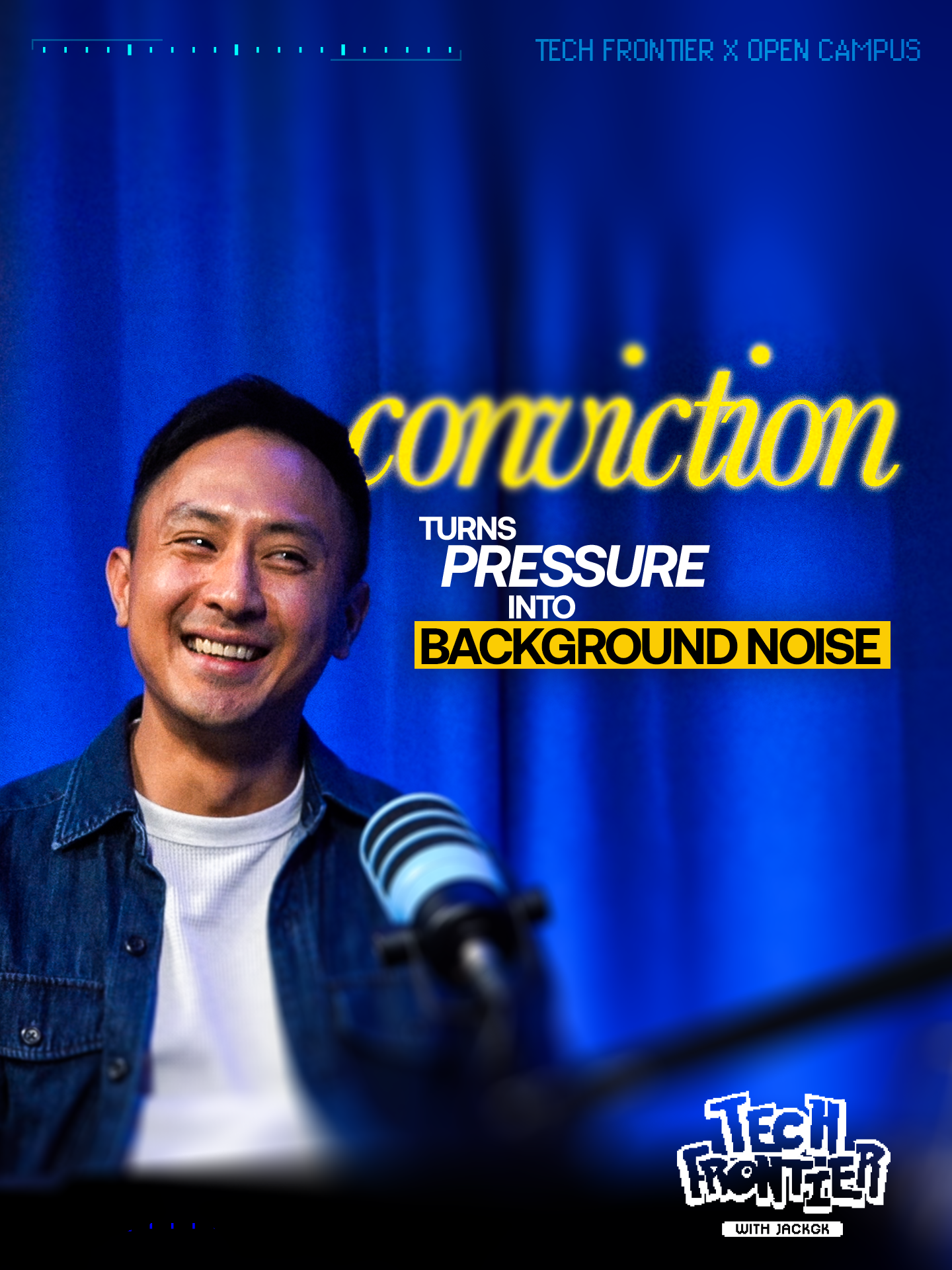
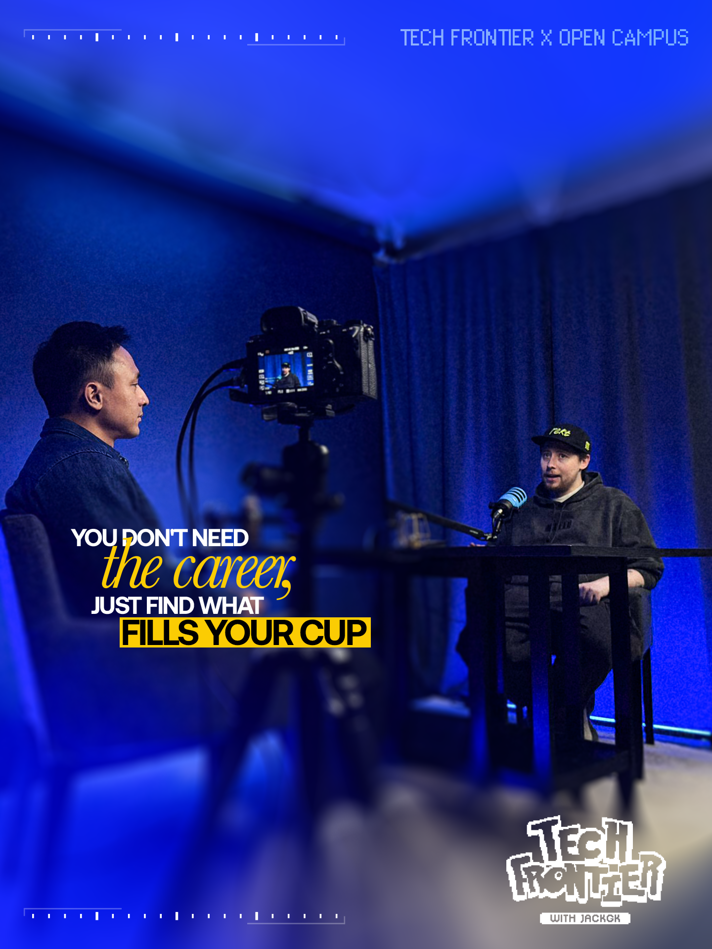
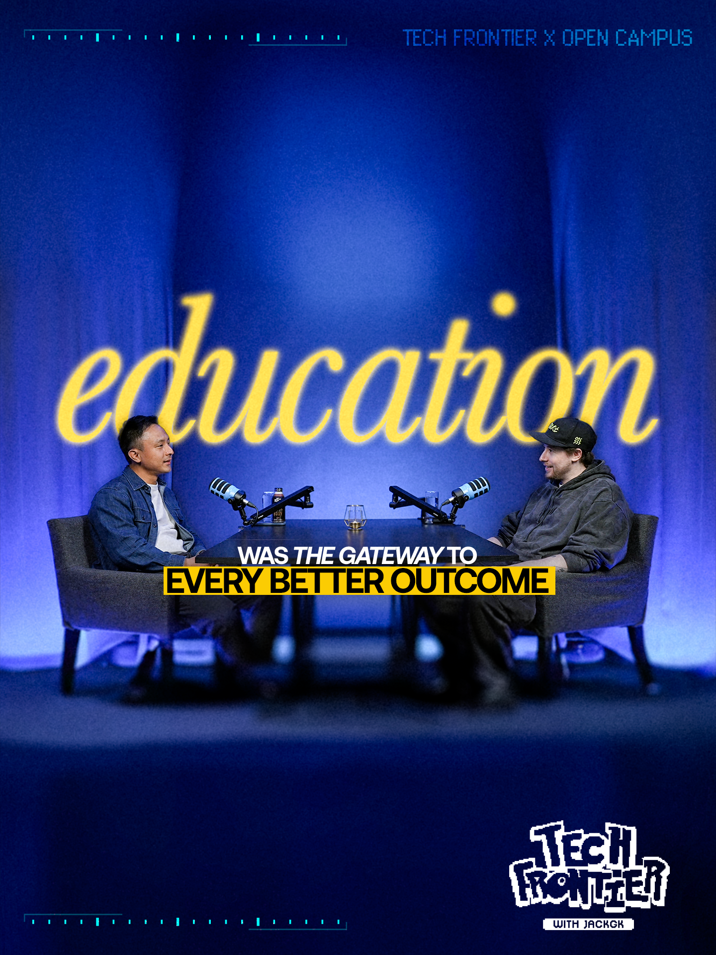
The Open Campus carousel set is the canonical reference. The rules below apply consistently across every card in a set.
Format & Safe Zone
- 9:16 vertical. X auto-crops to its preview ratio on scroll
- Keep all important content out of the top 544px and bottom 544px of the frame (based on 1920px card height)
- Test how the card looks at X carousel preview size — the headline must be legible
Photo Treatment — Frame Fill
The hero photo runs full-bleed. The unused area of the frame (the side opposite the subject) is a heavily blurred extension of the same photo — dark and out of focus. This gives the headline a clean place to sit and softens the composition.
- Wide BTS shots: generative-fill background out to 9:16, then apply heavy blur to everything except the subject
- Frame grabs where background is already in the shot: blur the non-subject side heavily in post
Colour Treatment
Most cards in a set should be full colour with high contrast. 1–3 cards per set can be fully monochrome/B&W — use this selectively for variety, not as a default.
Typography — Headline System
The headline is 2–3 lines with two emphasis treatments used together on every card:
- Italic serif in yellow — the lyrical / conceptual word (e.g. sentiment, liquidity, heal)
- Yellow highlight block, black sans-serif — the hard punch (e.g. NOT FUNDAMENTALS, A BAD LAUNCH, EVERY TIME)
- Remaining headline text: white, condensed bold sans-serif, uppercase
Example headline structure:
Headline Placement
- Place headline on the side opposite the subject's face — never overlapping the face
- Subject right → headline left. Subject left → headline right
- Vertically centred-ish in the safe zone, with breathing room top and bottom
Consistent Card Elements
- Top bar: faint dashed/ticked line (film reel / tape measure style). Top-right: TECH FRONTIER × [GUEST NAME] in light grey, all caps, small
- Bottom-right: pixel-art Tech Frontier logo with "WITH JACKGK" plaque. Same size and position on every card
- Bottom bar: same dashed/ticked line treatment as the top
- Grain: subtle film grain across the whole card — enough to take the digital edge off, not heavy
Open Campus — YouTube Thumbnail
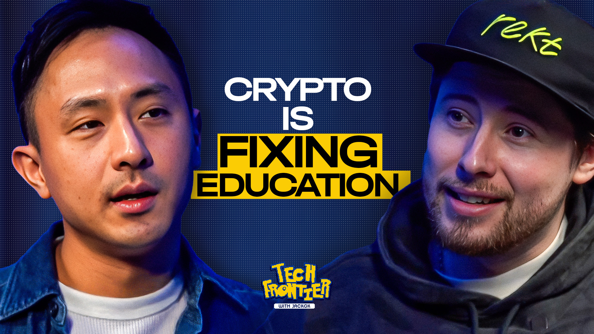
This is the template — same structure every episode.
Format
- 16:9, YouTube standard resolution
- Must read clearly at small thumbnail size — test at 320px wide
Composition
Two faces, big. Jack on one side, guest on the other. Both taken from a still or frame grab from that specific episode. The episode's actual background sits behind them, blurred.
- Pick frames where both subjects have expressive, readable faces — Jack smiling or laughing, guest mid-thought or making a point
- Flat or neutral expressions don't work at thumbnail size — pick for energy and expression
- Cut tight around the subjects — not too much empty space, not cropped at the neck
Typography
Headline sits between the two faces. Same yellow/black/white system as carousels but bigger. The number of lines and which line gets the yellow block varies — let the words determine the layout, not the other way around. Keep the total to ~6 words.
Logo Placement
- Pixel-art Tech Frontier logo at bottom-centre
- Smaller than on carousels — visible but not the focal point
- Faces and hook line are the focal point
Consistency Rule
Same logo placement, same face composition, same proportions every episode. The only things that change are the faces, the background, and the hook line. Don't vary the template.
Logo
Pixel-art "TECH FRONTIER" wordmark with "WITH JACKGK" plaque underneath. Cyberpunk / glitch style in royal blue and yellow.
- Use the transparent PNG — don't place on a white or coloured background
- Don't recolour it — royal blue + yellow version only
- The magenta + blue variant has been dropped — do not use it
- Don't recreate it from scratch — always source from the asset folder
Colour Palette
Typography
/podcast-social-copy to get the carousel lessons and thumbnail hook line candidates. Do not write these yourself — use the output.Run through this before sending anything for review.
- Yellow highlight block and italic yellow serif are both present in the headline (carousels) — or at minimum the highlight block (thumbnails)
- Top bar reads TECH FRONTIER × [GUEST] in the top-right corner
- Most cards are full colour + high contrast — 1 to 3 per set are monochrome, not the whole set
- All important content sits inside the X-crop safe zone — not in the top 10% or bottom 15%
- Headline is short enough to read at carousel-preview size on mobile
- For thumbnails: both faces are expressive — not flat or neutral
- Grain is subtle — not heavy
- Carousel copy came from
/podcast-social-copyskill — not written by hand